



Claim Processed /Month
49%

Mismatch Finding Time
36%
Claim Handling Time
54%
BEFORE
AFTER
Hover to reveal


Motor Insurance Claims Verification Portal
01 Context
The world this tool lives in
This is a case study about an internal tool, not a consumer product. It was used daily by insurance assessors
at a digital-first motor insurance company in India. To understand why improving it mattered, you need to understand the journey a motor insurance claim takes before it reaches anyone.
THE SCOPE
Around 70,000 claims come in per
month, every single one passes through the Admissibility portal first.

THE USERS
Insurance Assessors, 437 internal operations
staff who verify every incoming claim before
it moves forward in the pipeline.
1
HOW A MOTOR CLAIM MOVES THROUGH THE SYSTEM

Scope of this case study
2
WHAT IS ADMISSIBILITY?

You must have played the game ‘spot the difference’, right?
That's essentially what an Admissibility assessor does. Except instead of two cartoon images, they're comparing claim data submitted by the customer against policy records, vehicle databases, and documents. When everything matches, the claim is valid and moves forward. When something doesn't, it needs to be investigated before anything else can happen.
Admissibility is the first gate in the entire motor claims journey. Nothing moves forward until this step is done. Thousands of claims passed through this gate every month. And for years, nobody had stopped to ask, what does it actually cost the people doing it?
02 Story Time
But how it all started?

1
2
4
3
Built without a designer
The Admissibility portal was built entirely by developers. No designer was involved. No Information Architecture (IA). Just a functional screen to get the job done.
More rare cases, more engineering debt
Each edge case that appeared over the years meant another field added to the screen, showing every accumulation to everyone even if they didn’t need it.
Simple enough at first
The assumption was straightforward: assessors spot mismatches in claim data. The portal just needed to show that data. Nothing more.
The rare case appeared
Occasionally, a claim needed an extra data point verified, something the original screen didn't show. Developers patched it in.
03 Research
Finding out the problem
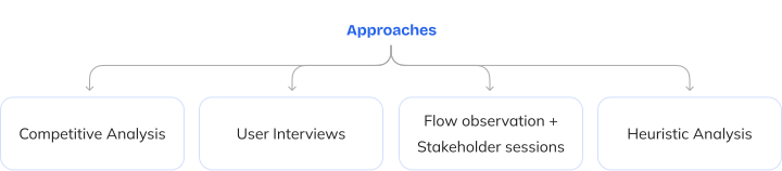
To understand what was actually broken, I planned the following approaches:


1
FINDINGS FROM THE RESEARCH
Some assessors ran two screens or multiple tabs simultaneously: admissibility portal on one, source-of-truth documents on the other. A self-made workaround to skip the back-and-forth of finding a data point and then verifying it.
When a mismatch needed another team's input (say, the Underwriting team), there was no structured way to flag it. It went out as an email or a chat message, and the update would be written in a generic remarks box at the bottom of the screen.
Rare case fields cluttered every screen whether needed or not.
No visual hierarchy, every field was identical, forcing assessors to read everything to find what mattered.
04 Problem
What research Revealed
The portal was slowing down the claim verification. Every delay at the Admissibility stage meant a slower claims journey for the customer, risking late settlements, eroding trust, and quietly damaging the company's reputation.
The portal was meant to help assessors make decisions, but it only showed them data, and left them to figure out everything else on their own.
Business Problem
User Problem
The qualitative picture was clear. The quantitative one confirmed it.

1
BUSINESS & USER GOALS
The portal needed to stop being a data display and start being a decision-making tool, one that tells assessors what's wrong, where it is, and what to do about it.
Business Goals
Reduce claim handling time per assessor
Increase claims processed per month
Faster claim settlement for the customer
Reduce errors in the verification process
Know immediately what's wrong in a claim
Focus on deciding, not on finding
Act on a problem without switching screens
Spend no time entering data
User Goals
📜 Reduced scroll
Key data visible without scrolling.
Actions reachable in fewer steps.
Assessors should verify, and
not transcribe.
🖱️️ Fewer clicks
⌨️️ Minimal keyboard use
UX Success Criteria: What I defined from research - analysis phase
05 Solution
FIxing what was broken
Before designing anything, I needed to sort out something more fundamental:
1
BREAKING THE LOOP OF PATCHWORKS
No matter how well I restructured the IA or decluttered the interface, if devs kept hardcoding new data points with rare-case claims, the loop of patchworks would just keep going. A better UI on top of a broken foundation was just a prettier version of the same problem. I had to break this loop, not design around it.
Working with the dev team, we moved to a Camunda rules engine. Instead of hardcoding every data point into the system, each one could now be added as an independent rule like a toggle. On, off, updated anytime. No code changes.
2
THE KEY INTERACTION (CONTEXTUAL ACTIONS PER DATA POINT)
The below four actions were planned by stakeholders from business POV as part of the new claims flow, each one mapped to a downstream process. My job was to bring them into the interface in a way that made the right action obvious at the right moment.
Add to OB
Data point tagged
Shown in OB call script
Customer confirms / denies
Assessor updates
(use: when a data point needs direct customer confirmation)
Add to OB
Generate Letter
Auto-formatted letter created
Sent to customer
Customer uploads docs
Verification continues
(use: when documents are missing from the customer)
Generate Letter
Refer to Ops / UW
Routed to correct team
Team reviews
Feedback shared
Assessor proceeds
(use: when a data point needs another team's input)
Refer to Operations/ Underwriting Team
Raise Alert
Tagged in internal tracker
Downstream teams notified
Handled with caution in later stages
(use: when a data point could impact future claim stages)
Raise Alert
3
THE THREE MILESTONES
Here are the three milestone iterations that shaped the final design:
Milestone 1
Actions were introduced, and data points were collapsed to reduce scrolling and keep assessors focused on one item at a time, but it proved inefficient in usability.
Milestone 2
Started grouping mismatches by sections and introduced summary headers, but clarity and visual hierarchy were still lacking. Also, where to place actions was a question.
Iteration 3
Adopted a card-based stacking layout, clear mismatch highlights, and fixed-position action buttons for faster assessor response.




06 Final Design
The Portal: Before and After
Select a problem to see where it lived on the old screen. Hit Solution to see how the new design addressed it.
Solution
Solution
Problem 1
Problem 2
Problem 3
Problem 4

Data meant for later stages (Survey and Assessment) but was permanently visible here. Nobody knew why. Devs responded "It's a hardcoded thing."
Irrelevant data, always visible
1
A DESIGN DECISION WORTH CALLING OUT
Some data points in the new design had up to three actions checkboxes: Add to OB, Add to Letter, and Refer to Ops. But not every data point needed all three actions. Some needed two. Some needed only one.
So how should the actions be arranged?
there are 3 ways to do this:
Why did option 3 earned the place?
Assessors build muscle memory around button positions like "Refer to Ops" is always on the far right (Nielsen's consistency and standards heuristic). Consistent placement means faster scanning and fewer errors under pressure. Assessors spend less mental energy locating actions and more on the decision itself.

Remaining action checkboxes shift left to fill the gap. Compact, but the position of each checkbox changes row to row.


All action checkboxes shown always, inactive ones greyed out. Visible but noisy. assessors have to consciously ignore irrelevant options under pressure.

Action checkboxes stay in their fixed positions. Empty slots remain as space, keeping every row aligned consistently.


07 Impact
What changed after it shipped
The new design (V4) was piloted in Dec 2024 and fully deployed from Jan 2025. Measured against the old version, the improvements were consistent across all four tracked metrics.
Avg. claim handling time
52%
faster
1:44 avg.
0:50 avg.
Jan–Mar 2025 · consistent across all three months
Unique claims processed per month
+64%
throughput
33,280 avg.
54,638 avg.
Feb 2025 peak day · 14,090 - nearly 5x any DC3 day
P90 processing time
52%
faster
3:30 avg.
1:41 avg.
Even outlier cases resolved significantly faster
Absolute mismatch time (Abs TMS)
34%
faster
1:46 avg.
1:11 avg.
Mismatch resolution - the hardest step got easier
Assessors weren't just working faster. The system had unlocked capacity that simply didn't exist before.
On Data Methodology: New Version figures, Jan–Mar 2025 (Dec 2024 excluded; pilot rollout, only 17 claims). All data sourced directly from internal stakeholders. No figures have been estimated or adjusted.
08 Learnings
Takeaway from this project
When users say everything is fine, that's the finding. Assessors had normalised the inefficiency so completely they couldn't articulate it. Watching them work revealed what asking never could.
In large systems, small UI decisions have large downstream consequences. A single action button placement changed the workflow of an entire team and every claim stage that followed.
Ruthless prioritisation is a design skill. The most impactful work was removing what's not needed at the moment, not adding more features. Showing what's needed, at the right time, was the biggest difference.
Design problems aren't always design problems. The clutter wasn't a layout issue, it was an architectural one. Recognising that and collaborating with developers to fix it at the root changed what the design could actually achieve.
